What a Hair Salon Website Should Actually Do (A Circle Gold Designer’s View)
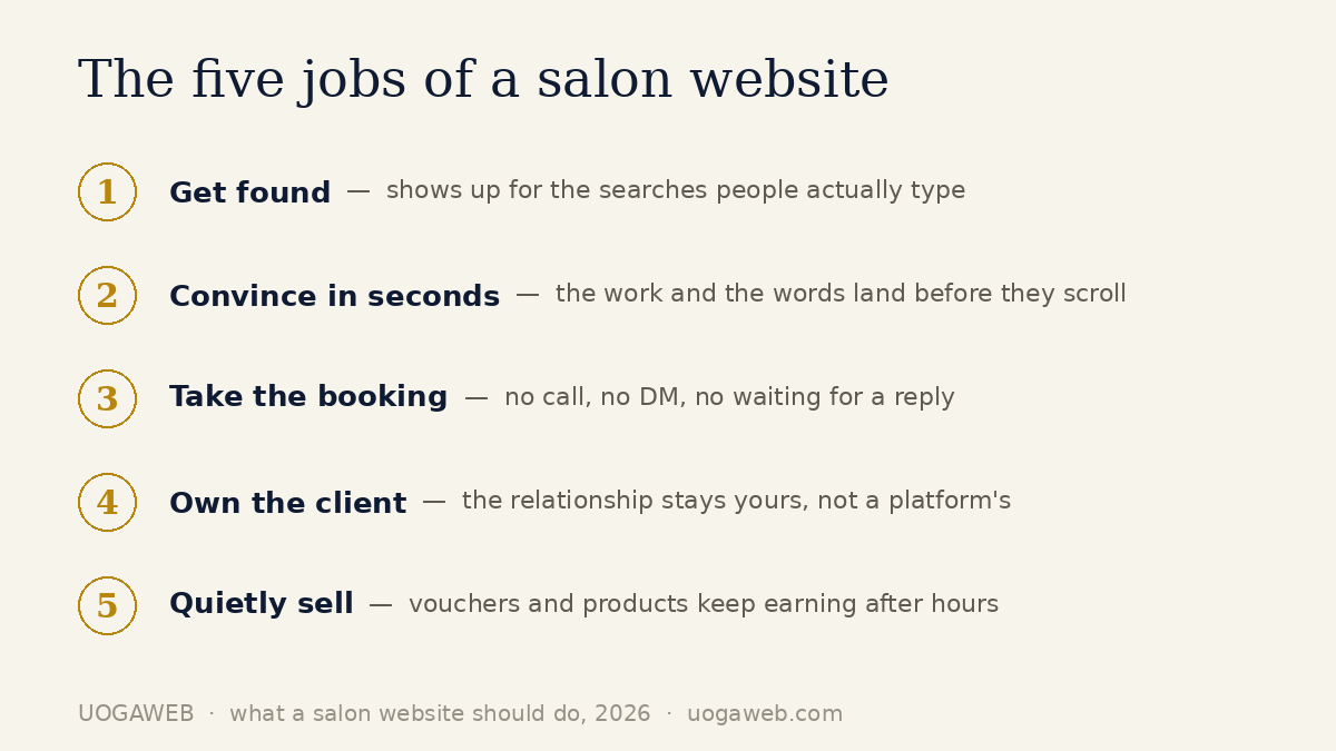
Here's what a salon website should do, and it has nothing to do with how pretty it is. A salon website has five real jobs: get found by people searching nearby, convince a stranger in seconds, take the booking right then with no phone call, own the client relationship instead of renting it from a platform, and quietly sell — vouchers, gift cards, product — while you're mid-colour and not looking at a screen. Everything else is decoration.
I hear some version of “what should my site actually do” every week, usually from an owner who's just seen a beautiful template and has a nagging feeling something's still missing. Sometimes the decoration is lovely — a gorgeous hero image, a clever scroll animation. But if it isn't doing those five jobs, it's a brochure that happens to load in a browser. Not a member of staff.
I design Squarespace sites for hair and beauty salons, and I'm a Circle Gold partner — Squarespace's own way of saying it's noticed. What follows is the answer I'd give a friend, not a sales page.
Job one: get found by the searches that matter
None of the other four jobs matter if nobody arrives. For a salon, “arrives” means someone typed “balayage Kentish Town” or “barber near me” into Google, and your site showed up, worth clicking on.
A Google Business Profile gets you into the map pack, and it's essential — but it isn't a website. It can't hold your price list or your actual work, and it disappears behind whatever the map pack looks like this year. The strongest setup pairs both: a profile as the front door, a site behind it doing the convincing.
On the site itself, getting found is less mysterious than it sounds: name what you are and where you are in the page title and the first line, not buried on an “About” page. Load fast on a phone, where almost all the salon traffic I see in my own builds' analytics comes from. And give each real service its own page — “[service] plus [town]” is exactly what people search, and a page that answers it directly beats a homepage that only implies it.
Job two: convince someone in seconds
You get a few seconds before a visitor decides whether to keep scrolling or hit back. Two things do almost all the work in that window: what the page says, and what it shows.
What should the homepage actually say?
One clear line about who you are and who you're for — not “welcome to our salon.” Evija Beauty, a studio I built in Vilnius, borrows trust instead of asserting it: a scrolling strip of the professional product brands she works with sits high on the homepage, so a visitor's opening impression is “trained on brands I recognise” before they've read a word. Edita Beauty takes the opposite route — a warm, six-page site with a client gallery and gift vouchers, nothing flashy, because her real edge is that clients book her. The site just has to sound like she does.
What it shows matters as much as what it says: real photos of real work and the real space, never stock models — clients spot the difference in under a second, and in this industry that instinct is sharp. On Maison Hair Studio, my UK concept build, positioning does quiet work before a single photo loads — a calm cream-and-blush palette and two well-chosen fonts already say “premium.” More of this in practice: 14 real salon website examples, mine and other people's.
Job three: take the booking, right then
A Book button that isn't reachable from every page is a Book button that loses people. Most salon sites still break this rule — booking buried in a submenu, or worse, a phone call required to make an appointment decided on at 11pm.
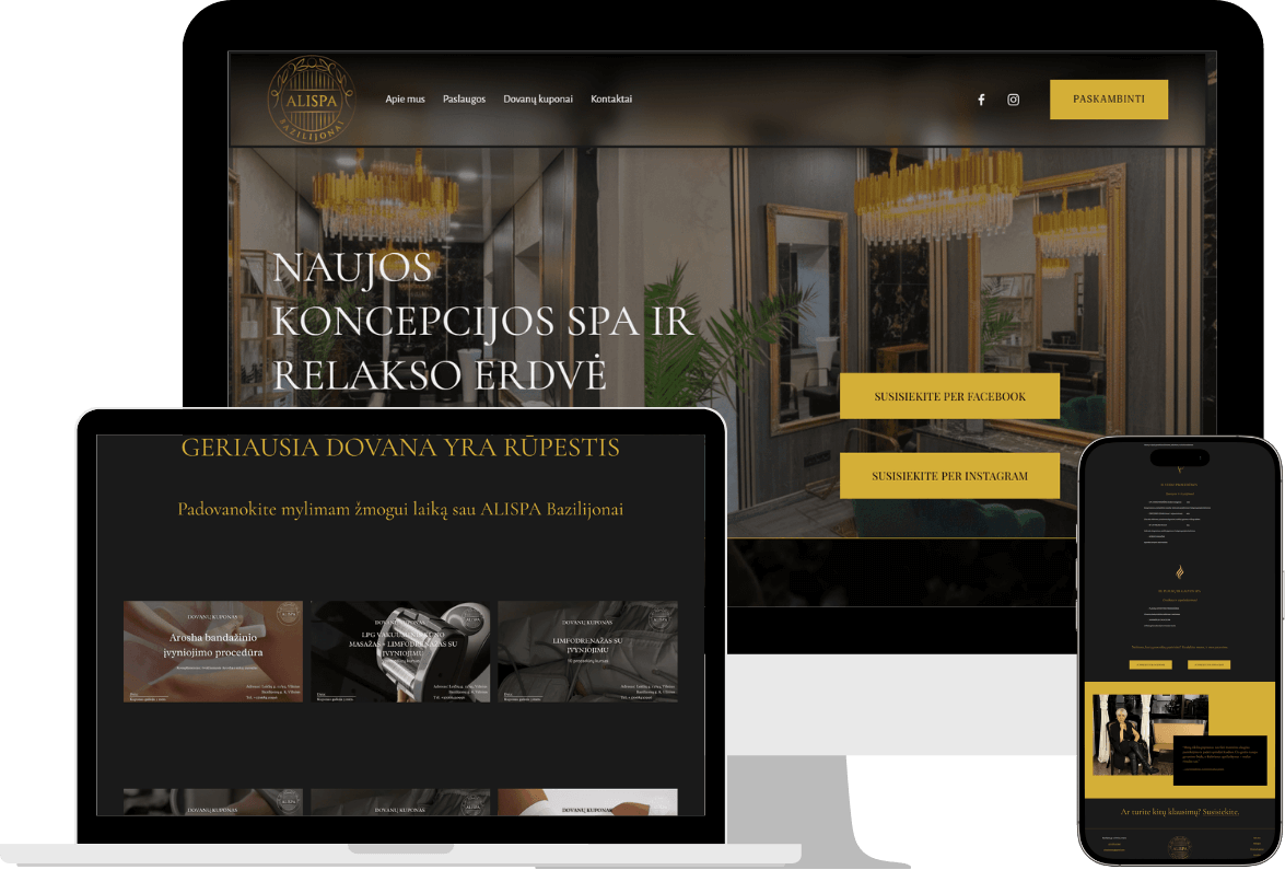
Price transparency belongs right next to it. ALISPA, a wellness and beauty clinic I built, publishes its full service price list directly next to booking — the braver choice, and the one that works. A visitor who can see the price before they click “book” isn't guessing, isn't emailing to ask, and isn't quietly assuming the worst. Full prices filter out the wrong enquiries and pre-sell the right ones.
Whatever booking tool sits behind the button — Squarespace's own Acuity Scheduling, or an embedded Fresha or Booksy widget — placement matters more than the software. I've written a full comparison of the booking options separately. Short version: booking should never be more than one tap away, on every page, no login, no phone call.
Job four: own the client relationship
Book a client through Fresha, Treatwell or Instagram, and the platform sits between you and them: it holds the email, sends the rebooking reminder — sometimes with a nudge to try someone else — and the review they leave builds its authority on Google, not yours.
None of this makes marketplaces bad. They're genuinely useful for getting discovered, and the commission they charge only applies to the brand-new clients their own marketplace sends — not a cut of every booking, and nothing on bookings made through your own site. I've broken down what salons gain and lose to marketplaces elsewhere.
What a website does that no platform can is put the relationship back in your hands: the client list is yours, the rebooking email is yours to send whenever the diary's thin, and nobody else's algorithm decides who sees you next. That's the fourth job — not replacing the marketplace, just not being entirely dependent on one.
Job five: quietly sell, even while you're closed
A website is the only member of your team that works while you sleep. Gift vouchers are the clearest example: someone decides at 2am that their sister needs a spa afternoon for her birthday, and if your site can sell that voucher right then, that's a sale you'd otherwise have missed entirely.
Vandens lelija studija, a beauty and wellness studio I built in Vilnius, runs this properly: facial and body rituals, an online shop, gift sets and gift cards, all sitting quietly alongside booking. None of it needs a salesperson — it just needs to be findable and easy to buy in under a minute. Maison Hair Studio, my UK concept build, carries the same idea into a hair salon: service menus and gift vouchers sold whenever the client happens to be thinking about them.
This is the job most salon sites skip, usually because it feels like “extra” rather than core. It isn't — it's revenue that costs nothing once it's built.
How do you know your current site is failing these jobs?
You don't need an audit to find out — the signs are usually obvious once you're looking for them.
Nobody books online. Bookings still come by phone or DM, even though the site has a booking page. That's a friction problem, not a traffic one.
Prices are hidden. “Contact us for pricing” reads as premium to the owner and as a red flag to everyone else. If your Instagram bio gets more price questions than your contact form does, that's the tell.
Instagram is doing the job your website should. If you post there because that's “where people actually look,” your website has quietly become decoration — exactly what this post argues against.
You can't find yourself. Search “[your service] [your town]” from your phone, signed out. If it isn't you on page one, neither can most of your prospective clients.
Any one of these alone is fixable. All four together usually means the site needs more than a tweak.
What should a redesign cost — and change?
In the UK, I build three tiers: Showcase at £800 for a salon that mainly needs to look right and get found, Booking at £1,000 for a salon that wants online booking built in, and E-commerce at £1,400 for a salon selling gift cards or products through the site. Full breakdown, including what moves the number, in what a hair salon website costs in the UK.
The number matters less than what should change. A redesign that's done its job doesn't just look newer — it now does the five jobs above: booking is one tap away, prices are visible, the homepage says something specific, the client data belongs to you, and there's a way to sell when the doors are locked. Tick those five and it's worth it at any of the three tiers. Tick only “looks more modern” and you've bought decoration again.
Ongoing care — updates, backups, small changes — runs at £75/month, with the first three months included on every build. Optional: plenty of owners are happy editing text and photos themselves once it's built right.
FAQ: what a salon website should do
What should a salon website actually include?
At minimum: a homepage that positions you in one line, a services page with visible prices, a booking button on every page, real photos of your work and space, and a way to buy a gift voucher without calling. Five to eight pages covers almost any independent salon — full breakdown on the salon hub. More pages isn't more professional; it's more places to get lost.
Is a beautiful website enough on its own?
No — that's really the whole point of this post. A beautiful site with a hidden booking button, no visible prices and stock photography loses to a plainer site that does the five jobs properly. Design taste is real and it matters, but it's the finish, not the foundation.
Does a salon website need a blog?
Not to do its five jobs, no. A blog can help you get found for more searches over time, but I wouldn't build one before the booking flow works, prices are visible and photos are real. Content is a later-stage lever, not a starting one.
Do I still need a website if I'm already on Instagram or a booking marketplace?
Yes, if you want to own any part of the relationship. Instagram and marketplaces are genuinely useful for reach and discovery, and you should keep using them — but the account, the algorithm, and on a marketplace the new-client relationship, all belong to someone else. Longer answer to this exact question here. Short version: a website is the one channel where all five jobs happen on ground you actually own.
How long does a redesign actually take?
For the salon sites I build, a few weeks from kickoff to launch is typical, staged so you approve the homepage before the rest is built. Slower if you're still gathering photos or writing service descriptions — usually the real bottleneck, not the build itself.
If your current site isn't doing these five jobs, that's usually a decision away from fixing, not a rebuild-everything problem. I offer a free 15-minute Squarespace consultation if you want a straight opinion on your specific site, and the builds mentioned above sit alongside more in my portfolio. No pitch, just an honest look.
Gediminas Vengrauskas is the founder of UOGAweb, a Squarespace Circle Gold studio building websites for hair & beauty salons across the UK and Lithuania.