
Stop Just "Looking Good": How to Turn Your Website Into a Sales Machine
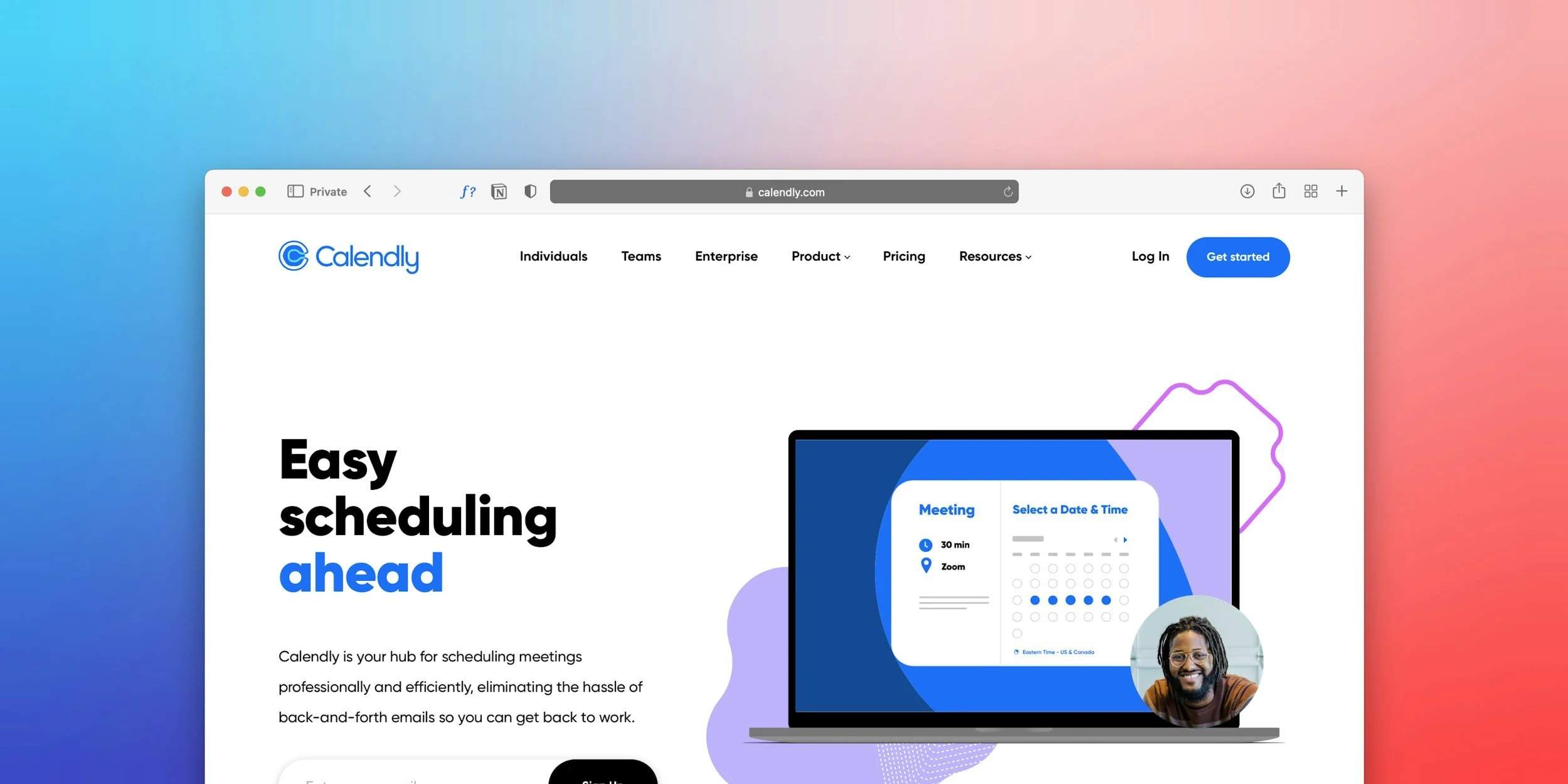
Calendry with Squarespace in 2026
There is a dangerous misconception in the design world: "If it looks beautiful, it will sell." This is false. We have seen stunning, award-winning websites that generate zero revenue. Why? Because they were designed as Art Museums, not Sales Funnels.
At UOGAweb, we practice Performance Design. This means every pixel, every color, and every button serves one purpose: Conversion.
Here is the exact 5-step framework we use to build websites that pay for themselves.
Sell stuff on Squarespace website
Step 1: The "Above the Fold" Test
When a user lands on your site, you have roughly 3 seconds to hook them before they hit the "Back" button. Most businesses waste this space with vague slogans like "Welcome to the future" or "Excellence in Service." The Fix: Your Hero Section must answer three questions instantly:
What do you do? (e.g., "Squarespace Web Design")
Who is it for? (e.g., "For Service Businesses")
What is the benefit? (e.g., "Get more leads")
Step 2: The User Journey Mapping
Amateurs design pages. Experts design journeys. Before we open the design software, we map out the "Ideal Client Path."
Awareness: They land on the Home page.
Interest: They read the "Pain Points" section (do they recognize themselves?).
Desire: They see the "Portfolio" (Social Proof).
Action: They see a clear "Book Now" button. If you leave dead ends (pages with no buttons), you lose clients.
Step 3: Mobile-First is Non-Negotiable
Look at your analytics. It is highly likely that 60-80% of your traffic is on mobile. Yet, most designers build on massive 27-inch monitors and treat mobile as an afterthought. We design for the phone first.
Are the buttons large enough for a thumb?
Is the font size readable without zooming (16px+)?
Do the images stack correctly? If your site annoys mobile users, Google will penalize you, and clients will leave.
Step 4: Trust Signals & Social Proof
In the digital world, trust is the currency. A visitor who doesn't trust you will never pay you. We strategically place "Trust Signals" throughout the site:
Testimonials: Not on a hidden page, but right next to the services.
Logos: "As seen in" or "Trusted by."
Case Studies: Showing the result you achieved, not just the output.
Face: Showing your photo. People buy from people.
Step 5: The "Direct" Call to Action (CTA)
Don't be shy. A "passive" website has a tiny "Contact" link in the footer. An "active" website guides the user. We replace vague buttons like "Learn More" with specific actions:
"Book Your Strategy Call"
"Get Your Quote"
"Start Your Project"
Summary: Is your website working hard enough?
Your website works 24 hours a day, 365 days a year. It never takes a sick day. If it isn't bringing you qualified leads every week, it is not an asset—it is a brochure.
Do you want a website that actually sells? Let’s Audit Your Current Site for Free