14 Beautiful Hair & Beauty Salon Websites (2026) — and Why They Work
Looking for hair salon website examples you can actually learn from? The best salon websites in 2026 share five habits: you can book within seconds of landing, the work is visible immediately, prices aren’t hidden, the headline says who the salon is for, and the whole thing loads fast on a phone. Design taste varies — those five don’t.
Below are 14 real hair and beauty sites that get it right, checked live the week I wrote this: London institutions, brand-builders, and independent studios. I design salon websites for a living, so instead of “isn’t this pretty,” each entry points at the one thing worth stealing. Full disclosure: five of the fourteen are my own builds — they’re labelled, and they’re here because independent salons on realistic budgets deserve examples too, not just famous names with retail money behind them.
What do the best salon websites have in common?
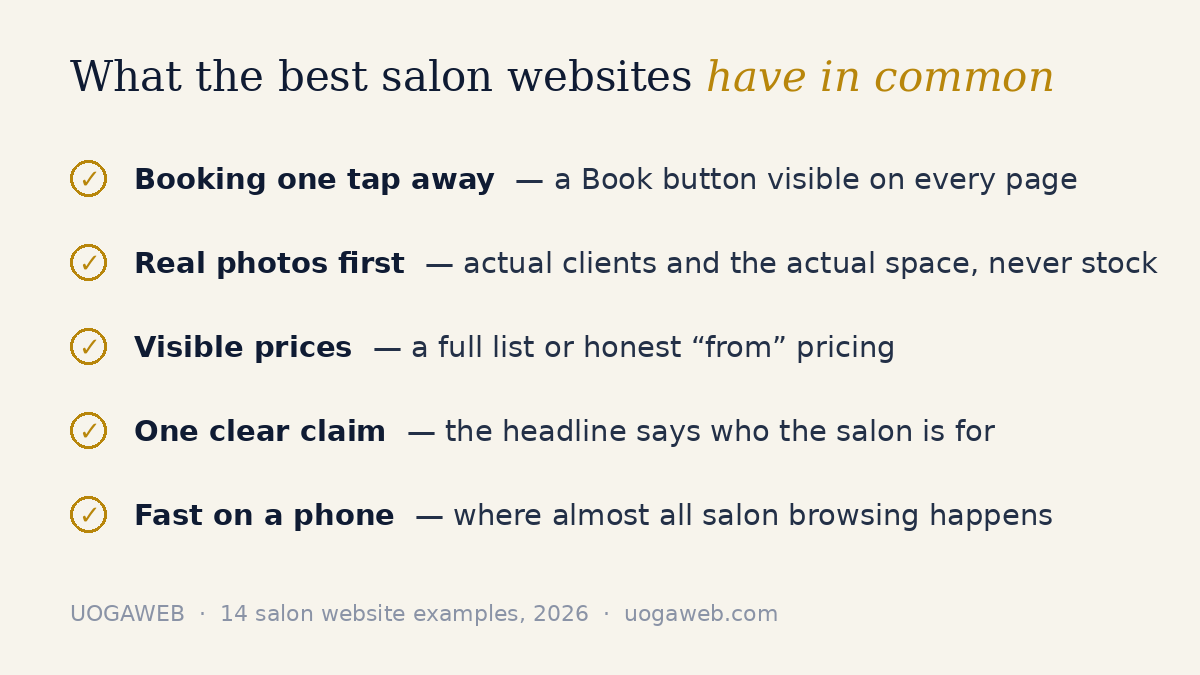
Before the list, the pattern. Strip away the branding and the strongest salon sites do the same five things:
Booking is one tap away. A Book button lives in the top corner of every page — nobody hunts for it.
The work shows up before the words. Real photos of real clients and the actual space, high on the page.
Prices are findable. A full list or honest “from” pricing — either beats silence.
The headline positions the salon. Organic. Luxury. Blow-dries. Award-winning barbering. One clear claim.
It’s fast on a phone. Most of the salon traffic I see in my own builds’ analytics is mobile. A slow homepage quietly cancels bookings.
Keep those in mind — every example below is some mix of the five.
London hair salons that get the basics right
1. Live True London — livetruelondon.com
A multi-location London group whose homepage title reads “London Hair Salon | London Hairdresser.” Not poetic — but it names exactly what they are and where, which is what both Google and a first-time visitor need. Worth stealing: say what you are and where you are in the first line, not the fourth paragraph.
2. Taylor Taylor London — taylortaylorlondon.com
Taylor Taylor’s salons are known for their interiors, and the brand’s homepage title — “Best Boutique Hair Salons” — makes the same claim in four words: the space itself is the product. Worth stealing: if your salon looks like nowhere else, photograph the room, not just the hair.
3. Duck & Dry — duckanddry.com
A blow-dry specialist, and the site commits to that single service: “Blow Dry Bars & Hair Salons London,” a dedicated booking page, and a hairstyle look book that lets clients browse styles before they choose. Worth stealing: the look book idea — an inspiration page keeps would-be clients on your site instead of on Pinterest.
4. Ruffians — ruffians.co.uk
Barbershops in London and Edinburgh with the proof up front — “Award Winning Barbershops” is right in the homepage title — and booking that runs through the Squire system rather than a phone call. Worth stealing: if you’ve won something real, put it in the headline. Modesty is invisible in search results.
When the salon becomes a brand
5. Hershesons — hershesons.com
A London hair institution that now runs salon and product business off one site — the homepage sells their styling products while the salon side sits alongside in the navigation. Worth stealing: a website can carry two businesses if the navigation stays disciplined. One menu, two clear paths.
6. Josh Wood Colour — joshwoodcolour.com
A personal brand built on colour expertise: at-home colour products and the salon business live side by side, with education doing the selling. Worth stealing: expertise content — explaining how you think about colour, cuts, skin — is what makes a premium price feel obvious.
7. Bleach London — bleachlondon.com
The colour brand that made bold hair mainstream, with a site personality most salons wouldn’t dare try. One honest footnote from checking it: the week I wrote this, the homepage title tag literally read “bleach-site” — a leftover developer label on one of the most famous salon brands in Britain. Worth stealing: the confidence. And the reminder that big names ship basic mistakes too — craft beats fame.
Positioning plays worth copying
8. Glasshouse Salon — glasshousesalon.co.uk
An East London salon that puts its values in the title itself: “Organic Hair & Sustainable Beauty East London.” You know within a second whether this salon is for you. Their booking hands off to Fresha’s page rather than staying on their own site — it works, though the booking journey (and the client relationship that comes with it) leaves their website at that point. I’ve written about what that trade-off means for salons separately. Worth stealing: a values-led positioning line, if you genuinely live it.
9. Townhouse — townhouse.co.uk
The nail salon group that proves two words can carry a brand: “Luxury Nail Salon.” The title tag alone does the price positioning before a single image loads. Worth stealing: pick your price position and make every element agree with it. Mixed signals cost more than either position would.
Independent studios that punch above their weight — my own Squarespace builds
These five I built myself at UOGAweb, so read them with that in mind. They’re here for a reason the famous examples can’t cover: none of these businesses had a retail brand’s budget, and the sites still do the same five jobs.
10. Maison Hair Studio
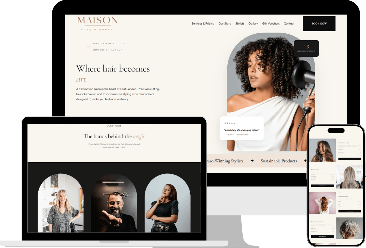
My UK salon concept build: eight pages, online booking that works at 11pm, team profiles, service menus and gift vouchers, in a calm cream-and-blush palette with Cormorant Garamond doing the elegance quietly. The full case study is here. Worth stealing: typography. Two well-paired fonts make a salon feel premium before a single photo loads.
11. Evija Beauty — Vilnius
A premium beauty studio where trust is built in seconds: a scrolling strip of the professional product brands she works with sits high on the page, and the whole layout funnels toward booking. Case study. Worth stealing: show the brands you work with — borrowed trust is still trust, and it’s free.
12. Edita Beauty — Kaunas
An established salon with a warm, personal site: six pages covering a multi-service menu, a client gallery and gift vouchers. Nothing flashy — deliberately. Her clients book because it feels like her. Worth stealing: warmth converts. If your salon’s edge is that people love you, the site should sound like you, not like a brand agency. Case study.
13. Vandens lelija studija — Vilnius
A beauty and wellness studio with a serene site that also quietly earns: facial and body rituals, an online shop, gift sets and gift cards alongside booking. Case study. Worth stealing: gift cards. They’re the easiest revenue a salon website can generate — sold at 2am, redeemed months later.
14. ALISPA — wellness & beauty clinic
A calming site whose bravest choice is transparency: the full service price list is published, next to direct booking. Worth stealing: full prices filter out mismatched enquiries and pre-sell the right ones — the clients who book already know what they’re paying, which is exactly the enquiry you want. Case study.
What pages does a salon website actually need?
Fewer than you’d think. Every strong example above is a variation of the same five: a homepage that positions and books, a services page with prices, a team or about page with real faces, a gallery of actual work, and a contact page that repeats the booking button. Five to eight pages covers almost any independent salon — I’ve broken down what each page is for on the salon hub. More pages isn’t more professional; it’s more places for a client to get lost.
How do the best salon sites handle online booking?
Two patterns show up across this list. Some keep booking on their own site — my builds run booking natively, and Duck & Dry routes to its own booking page. Others hand the booking to a marketplace widget, the way Glasshouse passes visitors to Fresha’s page. Both beat “DM us to book” by a mile. The difference is ownership: when booking stays on your site, the client, their details and the rebooking prompt stay yours. Either way, the button placement is non-negotiable — top corner, every page, visible without scrolling.
How should a salon website show prices?
Look at what the confident sites do: ALISPA publishes everything; plenty of London salons use “from £X” tiers, which is honest as long as the range is real. What loses bookings is silence. In my experience building these, a findable price list is one of the strongest booking signals a salon site sends — hiding prices doesn’t make you look premium, it makes a first-time client assume the worst and book somewhere that told them.
What about photography — do you need a professional shoot?
Eventually, maybe. To launch, no. The photography rule from every site on this list is real over perfect: your space, your team, your actual clients’ hair — never stock models, and never AI-generated faces, which read as fake within half a second in this industry. A recent phone, window light and one tidy corner of the salon will beat a generic stock library every time. Taylor Taylor leads with its rooms; Duck & Dry built a whole look book from its own work. That’s the standard — authenticity, not gloss.
What do even the big brands get wrong?
Two things kept surfacing while I checked these sites. First, basics slip: that “bleach-site” title tag is doing Bleach London’s search snippet no favours, and it’s a two-minute fix. Second, weight: retail-heavy homepages carry a lot of scripts and imagery, and you can feel it on a phone. Both are free lessons for an independent salon — a clean title that names your salon and city, compressed images, and a page that loads before the client’s patience does. The fundamentals are unglamorous, which is exactly why they’re an advantage: most competitors skip them.
How can an independent salon get this look on a real budget?
Here’s the part the inspiration listicles skip. The brand-name sites above mostly run on Shopify or WordPress stacks because they’re retail businesses with developers on call. A salon whose site needs to position, show work and take bookings doesn’t need that machinery — this is exactly the job Squarespace does well, and it’s why I build on it exclusively. My salon builds run £800–£1,400 depending on whether you need showcase, booking or a small store — the full breakdown is in what a hair salon website costs in the UK. The look on this list is a budget question far less than it’s a decisions question: positioning, booking placement, real photos, visible prices.
How do you use these examples without copying anyone?
Steal patterns, not palettes. The transferable things are structural — the booking button’s position, the one-line positioning claim, the visible prices, the look book idea, gift cards. The non-transferable things are what make a site feel like a specific salon: their photos, their words, their colours. Copy the second group and you’ll look like a tribute act; copy the first and you’ll look like you, done properly. If you want the working version of those patterns, run your own site through the 9-point salon website checklist — and for the thinking behind them, here’s what a salon website should actually do.
FAQ: salon website examples
What makes a good hair salon website?
One that books clients, not one that wins design awards. Concretely: a booking button visible on every page, real photography of your work and space, a findable price list, a headline that says who you’re for, and fast mobile loading. Every strong example on this list does those five things.
What’s the best platform for a salon website?
It depends what your site has to do. The retail-brand salons here run Shopify or WordPress because they sell serious product volume. For an independent salon that needs showcase, booking and maybe a small shop, Squarespace covers it with far less to maintain — here’s my honest comparison for salons.
How much does a salon website like these cost?
Big-brand sites cost whatever retail budgets allow. An independent salon doesn’t need that: my Squarespace salon builds run £800–£1,400 depending on scope, and I’ve published the full UK pricing picture — including the running costs most quotes leave out.
Can I build a salon website myself?
Yes — Squarespace makes DIY genuinely possible, and for a brand-new salon with more time than budget it can be the right call. Where a specialist earns their fee is the part templates don’t do: positioning, booking flow, price presentation and the SEO groundwork that makes the site findable. If you DIY, steal the five patterns at the top of this post.
Do these lessons apply to nail salons, brows, spa and wellness too?
Completely. Townhouse is nails, ALISPA and Vandens lelija are beauty-wellness, and the same five habits carry across: instant booking, real photos, visible prices, one clear claim, fast pages. Hair just gets the most attention because it’s the biggest category.
Want a salon website that does what these do? I’m Gediminas — founder of UOGAweb and a Squarespace Circle Gold member. I design salon and service-business websites you’ve seen examples of above, and my full portfolio is here. If you’re weighing up your own site, book a free consultation — 15 minutes, honest advice, no pitch.